Today's craft
Your site stops looking like 1995 — CSS begins.
Eight classes and two labs in, poshtik-campus/ is structurally excellent — real pages, real links, a real order form, real semantic anatomy, all under Git. And it looks like a school notice board. Today that changes: CSS — Cascading Style Sheets — is the language that describes how HTML should look. But before a single colour lands, you must learn the skill every CSS rule starts with: the selector — how a rule finds the elements it will style. Selectors first, properties next class. One new thing at a time.
Walk out of this room able to…
The idea first
What CSS is — and why it lives apart from HTML.
Since Class 3 this course has repeated one rule: HTML says what content means, never how it looks. That was a promise — "the looks come later." Today is later. CSS — Cascading Style Sheets — is a second, separate language whose only job is appearance: colours, sizes, spacing, fonts. Two languages, two jobs. The pros call this separation of concerns, and you've been living its first half for eight classes.
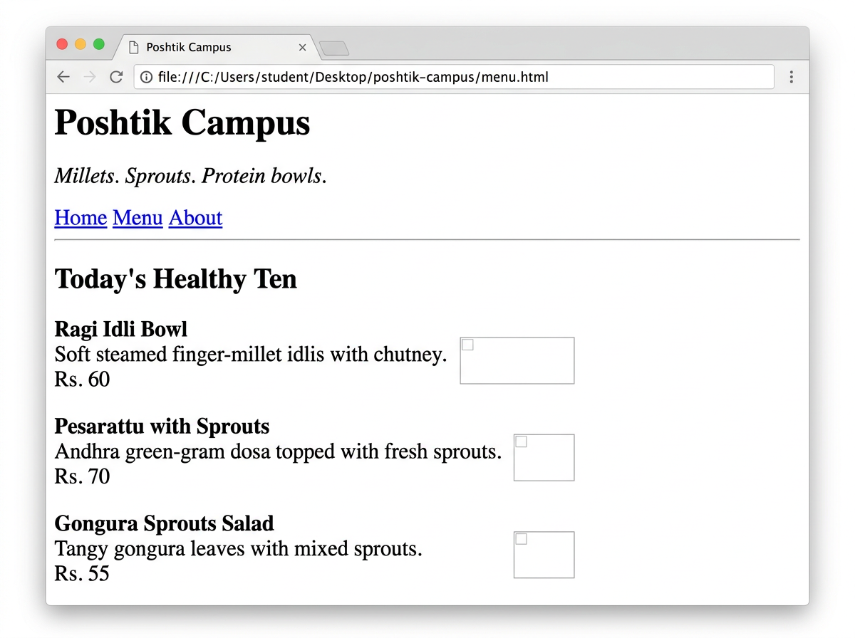
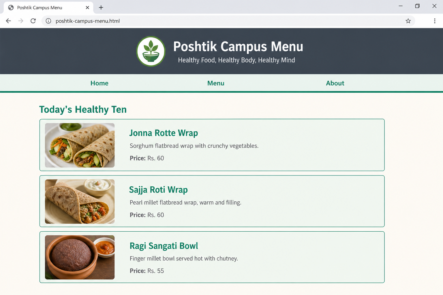
Put your finger on any change — the dark banner, the mint cards, the missing underlines — and ask "which tag was added to cause that?" The honest answer is always none. The HTML is byte-for-byte identical in both screenshots. That is what people mean when they say CSS is a presentation language: it never adds meaning, it only decides how existing meaning looks. Today's whole job is learning to write the left-hand side of a rule — the selector — so it points at exactly the element you meant.
One sentence to keep: HTML is the skeleton, CSS is the skin and clothes. The skeleton never changes when you change the outfit — and today you learn how an outfit finds the bone it dresses: the selector.
The C in CSS earns its keep later: several style rules can apply to the same element at once — from the browser's defaults, from your stylesheet, from more than one of your own rules. The cascade is the referee that decides which rule wins. You'll meet the referee properly in Activity 2 today, and formally when specificity is taught. For now: one language for meaning, one for looks, and a rulebook for conflicts.
Why does separation matter commercially? Because one stylesheet can restyle a thousand pages. When a brand changes its colours, engineers edit one CSS file — not a thousand HTML files. You'll feel a miniature of this today when one rule repaints ten dish cards.
Where CSS lives
Three ways to attach CSS. The course uses one.
The same tiny rule — make the heading green — written all three legal ways, each inside a complete, runnable file, so the differences are visible side by side. Watch where the CSS sits in each card.
Course rule, stated once and locked: we use external CSS from here on. Inline and internal exist, exams may name them (today's PYQ does not, but a later one will), and DevTools will show you inline styles in the wild — but everything we write goes in a .css file linked with <link>. Today's activity file is called style-start.css for exactly this reason.
Inline survives in two niches: HTML emails (many mail clients strip stylesheets) and quick JavaScript-driven changes you'll meet in Unit 2. Internal suits genuine one-page documents — a single-file report, a coding-exam answer where two files aren't allowed. Neither niche describes a multi-page site like poshtik-campus, which is why external wins here without argument.
The grammar
Every CSS rule ever written has this exact shape.
Learn this one anatomy and you can read any stylesheet on Earth — including the 4,000-line ones behind Swiggy. Three parts: who to style, what to change, and what to change it to.
Read it aloud, always the same way: "For every h1, set color to green." Selector → property → value. If you can say the sentence, you can write the rule. And note the two punctuation traps that eat marks: it's a colon between property and value (not =), and a semicolon after every declaration.
The braces can hold as many property: value; pairs as you like — that whole package is still one rule with one selector: h1 { color: green; text-align: center; }. Properties themselves are next class's topic; today every example deliberately uses only two or three simple ones (color, background-color, border) so your attention stays on the selector.
Selector № 1
Element selectors — name a tag, style every one of them.
The simplest selector is just a tag name, no punctuation at all. Write p and every paragraph on the page obeys — first one, last one, and every one you add next week. Watch it land one line per press, then check the preview.
<!DOCTYPE html><html lang="en"><head> <title>Element demo</title> </head><body> <h2>Millet Wraps</h2> <p>Jonna rotte, sajja roti — Telangana classics.</p> <h2>Protein Bowls</h2> <p>Ulava charu, paneer — the heavy lifters.</p></body></html>/* HTML is complete & plain above. Now add a <style> — one rule per press ↓ */ h2 { color: green; } /* ELEMENT rule — hits BOTH headings */ p { color: gray; } /* ELEMENT rule — grays BOTH paragraphs */Millet Wraps
Jonna rotte, sajja roti — Telangana classics.
Protein Bowls
Ulava charu, paneer — the heavy lifters.
First the plain HTML grows line by line (black serif, no colour). Then the last two presses add the h2 rule, then the p rule — each lands on the text already on screen.
The question element selectors can't answer: "style these paragraphs but not those." p hits every paragraph — dish descriptions and the footer's © line and the form's labels. The moment you want to pick a group of your own choosing, you need the next selector.
Selectors № 2 & 3 — the exam favourites
.class styles a family. #id styles an individual.
Picture a menu page holding ten <article class="dish"> cards and exactly one <header id="page-header"> — the textbook situation for each selector. Each selector below gets its own fresh, complete, from-scratch file (the same pattern as the PYQ solution): type it, run it, see the real output. Nothing from any earlier class is needed — every file below stands alone. First the family:
<!DOCTYPE html><html lang="en"><head> <meta charset="UTF-8"> <title>The class selector</title> </head><body> <article class="dish">Jonna Rotte Wrap</article> <article class="dish">Sajja Roti Wrap</article> <article class="dish">Ragi Sangati Bowl</article> <article class="dish">Ragi Idli Bowl</article> <article class="dish">Pesarattu with Sprouts</article> <p>Prices include all taxes.</p> <!-- NO class — the rule must leave this alone --></body></html>/* HTML is complete & plain above. Now add the <style> rule ↓ */ .dish { background-color: mintcream; border: 2px solid seagreen; padding: 6px 10px; } /* CLASS — every class="dish" */First the six plain HTML lines grow one per press. Then the last press adds the .dish rule — it boxes all five cards at once; the classless line stays plain.
.dish rule dresses all ten cards — and would cover dish № 50 the day the menu grows. You'll feel it yourself in Activity 1.Now the individual — #id.
<!DOCTYPE html><html lang="en"><head> <meta charset="UTF-8"> <title>The id selector</title> </head><body> <header id="page-header">Poshtik Campus Menu</header> <!-- the ONE header --> <article>Jonna Rotte Wrap</article> <!-- ordinary content — untouched --> <article>Ragi Idli Bowl</article></body></html>/* HTML is complete & plain above. Now add the <style> rule ↓ */ #page-header { background-color: darkslategray; color: white; padding: 12px; text-align: center; } /* ID — the ONE header */First the three plain HTML lines grow one per press. Then the last press adds the #page-header rule — only the one header gets the dark bar; the two articles stay plain.
<header id="page-header">.The choosing rule, worth 2 marks any day: will this style ever apply to more than one element? Yes → .class (many elements may share a class). Guaranteed exactly one → #id (an id is unique per page). When unsure, professionals default to .class — a family of one is legal, but an id can never become a family.
In the HTML you write class="dish" and id="page-header" — no dot, no hash. The dot and hash live only in the CSS: .dish means "elements whose class attribute contains dish", #page-header means "the element whose id is page-header". Writing class=".dish" in HTML is a classic first-week bug — the selector then has to be ..dish to match, which nobody ever intends.
One element may carry several classes at once — class="dish special" joins both the .dish family and the .special family. You'll use this constantly from Unit 3 onward.
This exact material was examined
PYQ — define a selector, name five types. 4 marks, right now.
You've now met three selector types and two more arrive in Part 9 — which means you can already score this real past-paper question from taught material. Model answer builds one point per press, the way you'd write it on the ruled sheet.
asked verbatim!Q11(b). What is a CSS selector? List any five types of selectors with an example for each. [4M]
Model answer — definition first, then the five types:
p { color: gray; } styles all paragraphs..dish { border: 2px solid green; }#page-header { color: white; } id must be unique per pagenav a { color: green; } styles only links inside the nav.h1, h2 { color: green; }✓ 3m for any five types + examplesHonest flag: descendant and grouped selectors appear in this answer before their teaching part (Part 9) — deliberately, because the exam answer needs five types and the two you haven't met yet are one line each. When Part 9 arrives, you'll recognise them instead of meeting them cold. Everything else above is already yours.
The proof, live. One press per line on the left — and the browser screen on the right grows the same moment. This single complete file uses all five selector types from the answer above, each labelled in a comment. Internal CSS is the right call here for exactly the reason Part 3 named: a one-file coding-exam answer.
<!DOCTYPE html><html lang="en"><head> <title>Five selectors, one page</title> </head><body> <header id="page-header">Poshtik Campus Menu</header> <nav><a href="menu.html">Menu</a> <a href="about.html">About</a></nav> <h1>Today's Healthy Ten</h1> <h2>Millet Wraps</h2> <p class="dish">Jonna Rotte Wrap — Rs. 60</p> <p class="dish">Ragi Idli Bowl — Rs. 50</p> <p>Prices include all taxes.</p></body></html>/* HTML is complete & plain above. Now add a <style> — one rule per press ↓ */ p { color: gray; } /* 1 · ELEMENT */ .dish { border: 2px solid green; padding: 6px; } /* 2 · CLASS */ #page-header { background-color: darkgreen; color: white; padding: 10px; } /* 3 · ID */ nav a { color: green; } /* 4 · DESCENDANT */ h1, h2 { color: green; } /* 5 · GROUPED */Menu About ← nav a: links inside nav only
Today's Healthy Ten
Millet Wraps ← h1, h2: one grouped rule painted both
Jonna Rotte Wrap — Rs. 60
Ragi Idli Bowl — Rs. 50
Prices include all taxes. ← p: element rule grays EVERY paragraph — the dishes too
First the whole page grows as plain HTML (black serif, blue underlined links). Then the five selector rules land one per press, each changing only what it names.
Slow-motion replay — watch the bare page dress itself, one selector at a time. The right side starts as the plain page: black text, blue underlined links, browser defaults — exactly what you get before a single CSS rule exists. Then press once per rule: each selector you reveal on the left lands on the live page instantly, changing only what it names. Plain HTML first — then CSS, in the order you type it, never in one jump.
/* the page is already on screen (plain, unstyled). Add rules ↓ */p { color: gray; } /* 1 · ELEMENT — every paragraph */.dish { background: mintcream; border: 2px solid seagreen; padding: 6px; } /* 2 · CLASS — only the dishes */#page-header { background: darkslategray; color: white; padding: 10px; } /* 3 · ID — the one header */nav a { color: seagreen; text-decoration: none; } /* 4 · DESCENDANT — links in nav */h1, h2 { color: seagreen; } /* 5 · GROUPED — both heading levels */Today's Healthy Ten
Millet Wraps
Jonna Rotte Wrap — Rs. 60
Ragi Idli Bowl — Rs. 50
Prices include all taxes.
Before any press the page is plain — black serif text, blue underlined links, no header bar (real browser defaults). Each press adds exactly one selector's rule.
C:\Users\student\Desktop\fswd-practice\class-09\selector-demo.html — the exact 40 lines from the panel; one file, nothing else neededMarks anatomy: 1 mark for the definition + 3 marks for five types with examples — and in a coding variant of this question ("demonstrate any five selectors"), the 40-line file above is the full-marks answer. Write the CSS comments naming each type exactly as shown: examiners reward answers that label their own evidence.
Three gaps. Style the whole menu.
Two small files, both typed by you, both from scratch — nothing from any earlier class is needed. First a tiny menu-practice.html (below — one header, three dish cards, two heading levels: a miniature of any real menu page). Then style-start.css — the properties are given; the three selector gaps are yours. Everything you need was taught in the last three parts. Open the page with Live Server and watch it transform as each gap is filled.
<!DOCTYPE html><html lang="en"><head> <title>Menu — selector practice</title> <link rel="stylesheet" href="style-start.css"> <!-- Class 8's link ritual --></head><body> <header id="page-header"> <!-- the ONE unique header — GAP 2's target --> <h1>Poshtik Campus Menu</h1> </header> <article class="dish"> <!-- the .dish family — GAP 1's target --> <h3>Ragi Idli Bowl</h3><p>Soft steamed finger-millet idlis · Rs. 50</p> </article> <article class="dish"> <h3>Jonna Rotte Wrap</h3><p>Telangana sorghum-flatbread wrap · Rs. 60</p> </article> <article class="dish"> <h3>Millet Protein Shake</h3><p>Ragi malt, jaggery, milk · Rs. 40</p> </article></body></html>Poshtik Campus Menu
Ragi Idli Bowl
Soft steamed finger-millet idlis · Rs. 50
Jonna Rotte Wrap
Telangana sorghum-flatbread wrap · Rs. 60
Millet Protein Shake
Ragi malt, jaggery, milk · Rs. 40
style-start.css and fill its gaps, THIS page transforms — no other file on Earth required./* Base look — given. floralwhite page, calm dark text. */body{ font-family: Arial, Helvetica, sans-serif; background-color: floralwhite; color: darkslategray;}/* GAP 1 — colour EVERY dish card at once (all ten carry class="dish") */___GAP_1___{ background-color: mintcream; border: 2px solid seagreen; padding: 12px; margin: 12px 0;}/* GAP 2 — the ONE unique page header (id="page-header") */___GAP_2___{ background-color: darkslategray; color: white; padding: 16px; text-align: center;}/* GAP 3 — one rule, TWO kinds of heading: every h1 AND every h3, seagreen */___GAP_3___{ color: seagreen;}<article>s carry class="dish". One rule must reach all ten. Hint: starts with a dot.menu.html has exactly one element with id="page-header". Hint: starts with a hash.h1 AND every h3 in the same seagreen, in a single rule. Hint: a comma is involved — and yes, this one type appears in the PYQ you just scored.- Type
menu-practice.htmlfirst (the panel above — 21 lines), then the starter into a NEWstyle-start.css, replacing each whole___GAP_n___token; nothing else changes. - The link is already wired — line 5 of menu-practice.html points at
style-start.css(Class 8's link ritual). - Save after each gap and refresh: one gap, one visible transformation.
menu-practice.html + style-start.css — both NEW, both typed by you, side by side in one folderC:\Users\student\Desktop\fswd-practice\class-09\ — today's sandbox; the project repo meets CSS in the labmenu-practice.html — keep it open while you fill gaps; every save repaints instantlyFill honestly first. A selector you copied styles a page once; a selector you chose styles every page you'll ever write.
The three selectors — and why each one.
/* Styles menu-practice.html (typed above): one header with *//* id="page-header", article class="dish" cards, h1+h3 headings. *//* GAP 1 — all ten cards share class="dish" */.dish{ background-color: mintcream; border: 2px solid seagreen; padding: 12px; margin: 12px 0;}/* GAP 2 — exactly one id="page-header" */#page-header{ background-color: darkslategray; color: white; padding: 16px; text-align: center;}/* GAP 3 — one rule, two heading kinds */h1, h3{ color: seagreen;}Poshtik Campus Menu
Healthy Food, Healthy Body, Healthy MindJonna Rotte Wrap
Telangana sorghum-flatbread wrap · Rs. 60Ragi Idli Bowl
Soft steamed finger-millet idlis · Rs. 50Millet Protein Shake
Ragi malt, jaggery, milk · Rs. 40The page starts plain (only the given body rule: floralwhite, dark text). Then each gap's rule lands in turn — GAP 1 boxes the dish cards, GAP 2 dresses the header, GAP 3 greens the headings.
#page-header rule out-ranks h1, h3; that's the exact fight Activity 2 inspects next.)The mistake worth naming: if GAP 1 came out as article instead of .dish — it works today, because all ten articles happen to be dishes. But the moment menu.html gains an <article> that isn't a dish (a news post, an offer banner), the element selector styles it wrongly. Select by role, not by tag — the class names the role.
Selectors № 4 & 5 — combining what you know
Descendant: "only inside here." Grouped: "all of these at once."
You met both in the PYQ as one-liners; now they get their honest treatment. Neither invents new punctuation-magic — a descendant selector is two selectors with a space, a grouped selector is several with commas. The meanings are opposites, and mixing them up is the classic slip.
First, the confusion everybody hits — out loud.
Almost every student meets the same wall here: a and nav a look like the same kind of thing, so it feels like nav a is just "a fancier way to say a". It is not. One of them is one selector; the other is two selectors joined by a space, and the space is a real word — it means "inside". Count the parts before you read the meaning, every single time.
1 Read the LAST name first — a — that is the element that actually gets the styling. 2 Then read leftwards: inside a nav — that is only a condition, and the nav itself gets nothing. Right-to-left is how the browser itself reads it, and it decodes every selector you will ever meet.
The one-sentence test, for the rest of your life: in a descendant selector, only the last part is dressed — everything before it is just directions to the address. In nav a the links get the colour and the nav gets nothing. Students who fail this question in the exam almost always styled the wrong half.
<!DOCTYPE html><html lang="en"><head> <meta charset="UTF-8"> <title>The descendant selector</title> </head><body> <nav><a href="index.html">Home</a> <a href="menu.html">Menu</a> <a href="about.html">About</a></nav> <!-- nav a reaches ONLY in here --> <article><p>Dish text with a <a href="recipe.html">recipe link</a> inside.</p></article> <!-- untouched --></body></html>/* HTML is complete & plain above. Now add the <style> rule ↓ */ nav a { color: seagreen; font-weight: bold; } /* DESCENDANT — read right-to-left: "a elements INSIDE a nav" */Home Menu About ← links inside <nav>
…dish text with a recipe link ← inside an article, NOT the nav
First both lines grow as plain HTML — every link blue & underlined (browser default). The last press adds nav a: only the nav's links turn seagreen & bold; the recipe link in the article stays plain blue.
The demo above showed nav a alone, so you had to imagine the difference. This file puts three links in three different places — one in the nav, one in an article, one in the footer — and then adds the two selectors one after the other. Watch the count change: the element rule paints 3 of 3, the descendant rule re-paints 1 of 3. Same page, same links, one space between the two behaviours.
<!DOCTYPE html><html lang="en"><head> <meta charset="UTF-8"> <meta name="viewport" content="width=device-width, initial-scale=1.0"> <title>a vs nav a</title></head><body> <nav><a href="menu.html">Menu</a></nav> <!-- LINK 1 · inside a nav --> <article>Try our <a href="recipe.html">ragi recipe</a>.</article> <!-- LINK 2 · NOT in a nav --> <footer><a href="contact.html">Contact us</a></footer> <!-- LINK 3 · NOT in a nav --></body></html>/* Three plain links on screen. Now a <style> goes INSIDE <head>, before </head> ↓ */ <style> a { color: crimson; /* ONE part — no location test → ALL 3 links */ } nav a /* TWO parts — "a INSIDE nav" → only LINK 1 */ { color: seagreen; font-weight: bold; } </style>Menu ← LINK 1 · inside <nav>
Try our ragi recipe. ← LINK 2 · inside <article>
Contact us ← LINK 3 · inside <footer>
NO RULES YET · 3 BROWSER-DEFAULT LINKSRULE a · MATCHED 3 OF 3 LINKSRULE nav a · RE-PAINTED 1 OF 3 LINKSPress 4 adds a — all three links go crimson at once, because an element selector never asks where. Press 5 adds nav a — only LINK 1 turns seagreen; links 2 and 3 stay crimson, because they fail the "inside a nav" test.
a → LINK 1 ✓ LINK 2 ✓ LINK 3 ✓
nav a → LINK 1 ✓ LINK 2 ✗ LINK 3 ✗
Why this pair matters in real stylesheets: nav links normally must look different from body links — no underline, brand colour, bold. With only element selectors you cannot say that: a would drag your article and footer links along with it. The descendant selector is how you keep one tag and two different looks, without inventing a single class.
<!DOCTYPE html><html lang="en"><head> <meta charset="UTF-8"> <title>The grouped selector</title> </head><body> <h1>Poshtik Campus Menu</h1> <h2>Today's Healthy Ten</h2> <h3>Jonna Rotte Wrap</h3> <!-- three heading levels, all plain --></body></html>/* HTML is complete & plain above. Now add the <style> rule ↓ */ h1, h2, h3 { color: darkslategray; } /* GROUPED — comma = a LIST: h1s AND h2s AND h3s *//* NOT the same as: h1 h2 h3 { … } — no commas = descendant chain: *//* "h3 inside h2 inside h1" = matches nothing */Poshtik Campus Menu h1
Today's Healthy Ten h2
Jonna Rotte Wrap h3
First the three headings grow as plain black HTML, one per press. The last press adds the single h1, h2, h3 rule — all three turn darkslategray at once.
One example is never enough to kill a confusion — the pattern has to repeat at a different tag before it feels like a rule instead of a trick. Same shape as Example 1, new cast: four paragraphs, two of them inside an <article>, one in the footer, one loose in the body. Predict the two counts before you press: how many does p hit, and how many does article p hit?
<!DOCTYPE html><html lang="en"><head> <meta charset="UTF-8"> <meta name="viewport" content="width=device-width, initial-scale=1.0"> <title>p vs article p</title></head><body> <p>Poshtik Campus — healthy food, hostel prices.</p> <!-- P1 · loose in body --> <article> <p>Ragi Idli Bowl — steamed, not fried.</p> <!-- P2 · INSIDE the article --> <p>Pesarattu with Sprouts — Andhra classic.</p> <!-- P3 · INSIDE the article --> </article> <footer><p>© 2026 Poshtik Campus</p></footer> <!-- P4 · in the footer --></body></html>/* Four plain paragraphs on screen. Now the <style> inside <head> ↓ */ <style> p /* ONE part → ALL 4 paragraphs, footer included */ { color: gray; } article p /* TWO parts → only P2 + P3 (the ones inside) */ { color: seagreen; } </style>Poshtik Campus — healthy food, hostel prices. ← P1 · loose in body
Ragi Idli Bowl — steamed, not fried. ← P2 · inside article
Pesarattu with Sprouts — Andhra classic. ← P3 · inside article
© 2026 Poshtik Campus ← P4 · in the footer
The gray bar on the left marks the <article>'s territory. Rule 1 grays all four. Rule 2 turns only the two inside the bar seagreen — P1 and P4 keep the gray they were given, because article p never even looked at them.
p → P1 ✓ P2 ✓ P3 ✓ P4 ✓ (4 of 4)
article p → P1 ✗ P2 ✓ P3 ✓ P4 ✗ (2 of 4)
Here is the part that quietly unlocks real stylesheets: a descendant selector's parts can be any selector you already know — element, .class, or #id, in any mix. .dish h3 reads right-to-left as "h3 elements, but only those inside something with class dish." Two dish cards carry an <h3>; so does the page's "About us" section, which is not a dish. Watch the About heading get skipped.
<!DOCTYPE html><html lang="en"><head> <meta charset="UTF-8"> <meta name="viewport" content="width=device-width, initial-scale=1.0"> <title>Class + descendant</title></head><body> <article class="dish"><h3>Ragi Idli Bowl</h3></article> <!-- H3 inside .dish --> <article class="dish"><h3>Jonna Rotte Wrap</h3></article> <!-- H3 inside .dish --> <section><h3>About us</h3></section> <!-- an h3, but NOT inside .dish --></body></html>/* Three plain h3s on screen. Now the <style> inside <head> ↓ */ <style> h3 /* ALL 3 headings — About included */ { color: dimgray; } .dish h3 /* only the 2 dish titles */ { color: seagreen; font-style: italic; } </style>Ragi Idli Bowl
<article class="dish">Jonna Rotte Wrap
<article class="dish">About us
<section> — no class="dish"Rule 1 grays all three headings. Rule 2 turns the two inside a .dish box seagreen and italic — "About us" stays gray, because its box has no class="dish" and the second test fails.
You could write class="dish-title" on each <h3> and select that instead — and it would work. But on a ten-dish menu that is ten extra attributes to type, and eleven the day a dish is added. .dish h3 says the same thing once and covers every dish card that will ever exist. Descendant selectors are how you stop editing HTML every time you want a new style.
This is the second half of the confusion, and it costs marks: students accept that nav a means "a inside nav", then quietly assume it means immediately inside — a direct child. It does not. A descendant selector reaches every level down: a child, a grandchild, a great-grandchild, forever. Here the link is buried three levels deep — nav → ul → li → a — and nav a still finds it.
<!DOCTYPE html><html lang="en"><head> <meta charset="UTF-8"> <meta name="viewport" content="width=device-width, initial-scale=1.0"> <title>How deep does inside go?</title></head><body> <nav> <!-- LEVEL 0 · the nav --> <ul> <!-- LEVEL 1 · a list inside the nav --> <li> <!-- LEVEL 2 · a list item --> <a href="menu.html">Menu</a> <!-- LEVEL 3 · the link, 3 deep --> </li> </ul> </nav> <a href="help.html">Help</a> <!-- OUTSIDE the nav entirely --></body></html>/* Both links plain. The SAME rule from the first demo, in <head> ↓ */ <style> nav a /* still reaches 3 levels down */ { color: seagreen; font-weight: bold; } </style>Help ← outside the nav ✗ · never matched
The green bar is the nav's territory; each gray bar is one level deeper. The last press adds nav a — the Menu link goes seagreen even though two whole elements sit between it and the nav. Help, one line below and outside the bar, is untouched.
The exam trap, stated plainly: "descendant" is a family word, not a distance word. Your grandchild is your descendant. If a question shows you a link inside a <ul> inside a <nav> and asks whether nav a matches, the answer is yes — and half the class writes "no, it's not a direct child."
The cruellest version of this confusion is not descendant-vs-element — it is descendant-vs-grouped, because a space and a comma sit one keyboard key apart and both "look fine". So here are twins: the same page, styled by .dish p in one file and .dish, p in the other. One paints the description inside the card. The other paints the card itself and every paragraph on the page. Same eight characters, plus or minus a comma.
<!DOCTYPE html><html lang="en"><head> <meta charset="UTF-8"> <meta name="viewport" content="width=device-width, initial-scale=1.0"> <title>Twin A — space</title></head><body> <article class="dish"><p>Steamed, not fried.</p></article> <!-- p INSIDE .dish --> <p>Prices include all taxes.</p> <!-- p OUTSIDE any .dish --></body></html>/* Now the rule, in <head> — note the SPACE, no comma ↓ */ <style> .dish p /* "p inside .dish" — ONE target */ { background-color: gold; } </style>Steamed, not fried.
Prices include all taxes. ← outside the card
Exactly one thing goes gold: the paragraph inside the dashed card. The card itself stays unpainted, and so does the paragraph below it.
<!DOCTYPE html><html lang="en"><head> <meta charset="UTF-8"> <meta name="viewport" content="width=device-width, initial-scale=1.0"> <title>Twin B — comma</title></head><body> <article class="dish"><p>Steamed, not fried.</p></article> <!-- byte-identical to Twin A --> <p>Prices include all taxes.</p> <!-- byte-identical to Twin A --></body></html>/* Same rule — ONE comma added after .dish ↓ */ <style> .dish, p /* "every .dish AND every p" — THREE targets */ { background-color: gold; } </style>Steamed, not fried.
Prices include all taxes. ← painted too!
Three things go gold: the card (because it is a .dish), its paragraph (because it is a p), and the paragraph below (also a p). The whole block floods — this is what students see when they "just add a comma to be safe".
Your five-selector kit is complete: element · .class · #id · descendant (space) · grouped (comma) — exactly the five the PYQ demands, every one now practised against a menu page you typed yourself. Selector № 6 (:hover and friends) is previewed in Part 12, taught properly later.
The five types are LEGO bricks, not sealed boxes: .dish h3 (descendant of a class) means "h3s inside dish cards"; nav a, footer a (grouping two descendants) means "links in the nav AND links in the footer". Read any combined selector right-to-left with the space as "inside" and the comma as "and also" — it decodes every selector you'll meet this semester.
Two rules want the same heading. Who wins — and how do you see it?
After Activity 1 your stylesheet holds a trap you built yourself without noticing: the h1, h3 rule paints headings seagreen — but the #page-header rule makes everything inside the header white. The <h1> sits inside the header. Two rules, one element, one colour on screen. DevTools shows the fight.
menu-practice.html (Activity 1's page, gaps filled) in Chrome (Live Server or double-click — either works for inspecting).<h1> (line 9 of the file you typed) highlighted in the Elements panel.color for this element. Count them.Why this matters beyond today: "my CSS isn't applying!" is the single most common beginner cry — and it's almost never a typo. It's a lost fight you didn't know was happening. The Styles panel is the referee's scoreboard: from today, you never guess why a style didn't land — you look.
Actually right-click and inspect first. The panel teaches your eyes things this page can only describe.
The annotated Styles panel.
color: seagreen; ← struck through = LOST
}
color: white; ← alive = WON (inherited by the h1)
background-color: darkslategray;
}
Why did #page-header win? The short version you can hold today: an id selector is more specific than an element selector — CSS trusts the rule that identifies its target more precisely. The full ranking system is called specificity, and it gets its own proper treatment with the cascade in a later class. Today's takeaway is the skill, not the formula: when two rules fight, DevTools shows you the fight — and the strikethrough names the loser.
In the Styles panel, click the white value and type gold — the heading changes instantly, without touching your file. This is how professionals prototype: experiment live in DevTools, then copy the winner into the real stylesheet. Refresh and the experiment vanishes — DevTools edits are a whiteboard, never a save.
Selector № 6 exists — states, not elements.
Everything today selected elements by what they are. There's a sixth family that selects by what state they're in: pseudo-classes, written with a colon. Two names to recognise now — full treatment comes with the properties classes.
<!DOCTYPE html><html lang="en"><head> <meta charset="UTF-8"> <title>A taste of :hover</title> <style> .dish { background-color: mintcream; border: 2px solid seagreen; padding: 6px 10px; } .dish:hover /* "a .dish — but only WHILE the mouse pointer is over it" */ { background-color: palegreen; /* palegreen — clearly lighter */ } </style></head><body> <article class="dish">Jonna Rotte Wrap</article> <!-- hover it — same element, new STATE --> <article class="dish">Ragi Idli Bowl</article> <article class="dish">Pesarattu with Sprouts</article></body></html>/* also meet: li:first-child — "an li that is its parent's first child" */Correctly flagged as deferred: pseudo-classes are named today only so the colon syntax doesn't ambush you in DevTools or online examples. They are not in today's PYQ's expected five, and you won't be asked to write one yet. If you're curious tonight, add the .dish:hover rule above to your own style-start.css — it works right now.
Take it home
Your selector kit — the whole class on one card.
| SELECTOR | WRITTEN AS | SELECTS | POSHTIK EXAMPLE |
|---|---|---|---|
| Element | p | Every element with that tag name | p { color: gray; } — every paragraph |
| Class | .dish | All elements sharing class="dish" — a family you define | .dish { border: 2px solid green; } — all ten cards |
| ID | #page-header | The ONE element with that id (unique per page) | #page-header { color: white; } — the header |
| Descendant | nav a (space) | Matches of the right part inside the left part | nav a { color: green; } — nav links only |
| Grouped | h1, h3 (comma) | Everything each listed selector matches — "and also" | h1, h3 { color: green; } — both heading kinds |
| Pseudo-class | .dish:hover | Elements in a state — preview only, taught later | .dish:hover { … } — while the mouse is over |
Class 9 · closed
Your site can find any element it wants to dress. Next: the wardrobe.
Today you learned the who of CSS — five ways to aim a rule, practised on a live menu page you typed yourself, plus the referee's scoreboard when two rules fight. Class 10 brings the what: colours, fonts, text properties, and the site-wide style.css idea — one sheet, many pages. The selectors you aimed today are the hooks everything from here to Unit 5 hangs on.
- Before next class: finish both Activity files if you haven't — menu-practice.html + filled style-start.css, transforming live.
- Five-minute drill: without notes, write the five selector types with one example each — that's the PYQ, cold.
- Optional taste: add the .dish:hover rule and feel your menu respond to the mouse.